18 tattoo font directions
Compare hollow outline, script, Chicano-inspired, Gothic, Old English, typewriter, street brush, dark horror, Roman, stencil, block, and minimalist lettering.
WORDS MADE FOR INK
Type a name, date, or short phrase, compare 18 tattoo font styles, adjust the lettering, and download a free PNG reference.
LIVE LETTERING PREVIEW
Font direction
Fine Script
Spacing
1 px
Finish
Solid ink
The font preview stays in your browser. Next, place the downloaded artwork on a body photo to judge real scale.
MADE FOR A REAL TATTOO DECISION
Tattoo lettering is more than choosing a beautiful typeface. Compare spacing, stroke weight, case, and placement so the words can remain clear after application and healing.
Create tattoo letteringCompare hollow outline, script, Chicano-inspired, Gothic, Old English, typewriter, street brush, dark horror, Roman, stencil, block, and minimalist lettering.
Enter your own name, memorial date, word, or short phrase instead of browsing fixed samples.
Adjust size, letter spacing, case, and solid or outline treatment to compare legibility.
Export paper, white, or transparent artwork for a tattoo artist to redraw and refine.
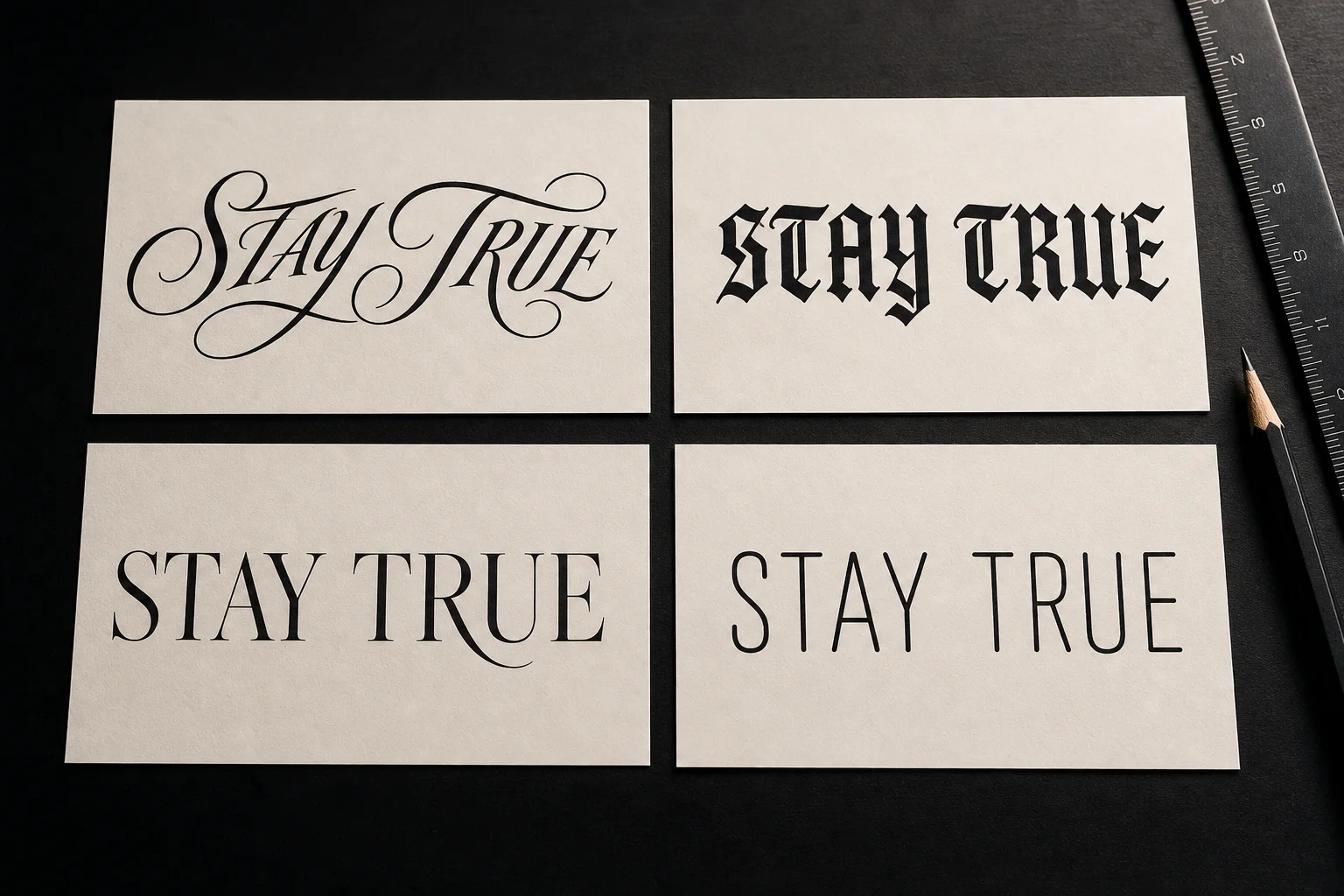
SAME WORDS, DIFFERENT VOICE
A tattoo font generator is most useful when the wording stays fixed. Compare the same name, date, or quote across several directions, then narrow the options by real size, placement, and long-term readability.
Script feels personal and fluid, but long flourishes need enough room to stay separate on skin.
Old English and display lettering need more width and open counters when the final tattoo will be small.
Compare the exact spelling, spacing, and capitalization you intend to tattoo—not a generic sample word.
THREE SIMPLE STEPS
Start with the real words, compare lettering, and export a reference. The complete workflow uses no AI credits.
Type a name, date, word, or short phrase across up to three lines.
Compare 18 directions, then tune scale, spacing, case, and ink finish.
Save a PNG, then ask an artist to redraw it for placement, size, and healed clarity.
TATTOO FONT DIRECTORY
The same words can communicate a completely different mood in each style. Choose a direction for meaning, then filter it through real size and placement.
Modern
A clean hollow display face for open, high-impact lettering.
Script
Elegant connected strokes for names and short phrases.
Script
Friendly, rounded lettering with a confident rhythm.
Script
Expressive flourishes for initials, vows, and names.
Script
Decorative swashes for bold names and initials, ready for an artist to adapt.
Blackletter
Dense historic letterforms with a ceremonial presence.
Blackletter
Sharp vertical contrast for dramatic tattoo lettering.
Blackletter
Decorative medieval forms that remain compact and bold.
Blackletter
Dripping distressed forms for horror and dark-themed words.
Display
A vintage display face suited to banners and bold words.
Display
A classic fixed-width typewriter rhythm for dates, notes, and short quotes.
Classic
Structured capitals for dates, mottos, and memorial text.
Classic
Refined italic serif forms for literary quotes.
Personal
An informal human touch for intimate, personal wording.
Personal
Heavy marker strokes for raw, energetic street lettering.
Display
Cut-out letterforms with strong industrial readability.
Modern
Condensed impact for a short word or powerful statement.
Modern
Clean contemporary lettering with minimal decoration.
POPULAR LETTERING USE CASES
NAME TATTOOS
Compare flowing script, handwritten, and classic serif lettering. Check whether capitals, connections, and flourishes still read clearly at the intended size.
DATE TATTOOS
Test Roman capitals, minimalist numerals, or bold block lettering. Keep spacing generous enough for small dates to age clearly.
QUOTE TATTOOS
Longer wording needs a restrained font, line breaks, and placement-aware scale. Treat the preview as a composition brief for your artist.
LEGIBILITY BEFORE DECORATION
Details that look crisp on a screen may not hold on skin. Before application, an artist should redraw stroke weight, counters, spacing, and the fit across body curvature.
Dense Gothic forms and hairline scripts can close up when tattooed too small.
Useful spacing and open counters help lettering stay clear after healing.
Forearms, collarbones, ribs, and backs need different baselines and composition.
Final linework should be adapted to size, skin, and technique by a professional.
FREQUENTLY ASKED QUESTIONS
Enter a name, date, word, or short quote and choose a lettering style. The preview updates instantly, and you can adjust letter spacing, scale, case, finish, and background before downloading a PNG reference.
Yes. The lettering preview and PNG download run in your browser and do not use generation credits.
The picker includes 18 directions: hollow outline, script, cursive, Chicano-inspired, calligraphy, Old English, Gothic, blackletter, dark horror, traditional, typewriter, Roman, serif, handwritten, street brush, stencil, block, and minimalist.
Use it as a visual reference. A tattoo artist should redraw the lettering for the final size, body curve, stroke weight, spacing, and long-term legibility.
Names often suit script, calligraphy, or classic serif styles. Dates usually benefit from Roman, minimalist, or block lettering. The best choice also depends on size and placement.
No. Dense blackletter, very thin script, and tight spacing can lose clarity when tattooed too small. Compare the design at the intended scale with your artist.
Use the real words, find a direction, then refine it with your artist.